Introduction

In any rankings list, regardless of the product in question, it is the top four slots which really matter. And it's no different for touchscreen infotainment systems. So without much ado, we shall reveal the cars (and their touchscreen systems) that managed to slot in from fourth to first place. In a separate story, we have looked at the systems that secured positions from the eighth to the fifth and you can read about that here as well as how we went about assesing the touchscreen systems.
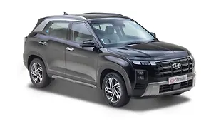
Hyundai Creta- 171.5/400

Why I would touch it- Wireless charging and easy to use interface
Why I wouldn’t touch it- Placement of display and lack of punch in the graphics

The Hyundai Creta gets a slightly more advanced version of the infotainment package offered in cars like the Grand i10, but the interface is pretty much the same. The display for the infotainment system matches the segment standard and has the right mix of both resolution and the size of the text.

We felt that the while the strong backlight is able to compensate the effect of the sunlight, the display is placed too low for our liking. In fact, if there had been no clock, and the top of the display had started off just below the plastic cowl, it would have scored much higher in these two subjective sections.

Hyundai has always been known to use good quality plastics and this is evident in the touch, feel and size of the buttons.
The Creta is only one of the few cars in this price bracket to offer wireless charging and this, along with the USB port and 12V socket, is packaged rather tightly behind the gear lever.

Its features list has always been a strong point for Hyundai and its cars come with all forms of phone connectivity, wireless charging, in-built maps, dynamic tracking for the reverse camera. There is also a dedicated sound package developed by Arkamys for the Creta.

As we had said previously, the graphics are functionality over form. The designs are easy to understand, but they lack the extra bit of pizazz offered by the rivals.

The steering mounted buttons have a minor lag but it’s not something that is easily noticeable and more over, it also has a dedicated voice command button but that system works only with smart phone connectivity. Finally, in the music quality test, the Hyundai system scored an average of 3/5.
Volkswagen Vento- 180.1/400

Why I would touch it- Sound quality and graphics
Why I would not touch it- Placement of input ports

The winner of our previous infotainment system series has found itself in third place in this round of testing and by the smallest of margins. At first glance, the angle and placement of the display on the dashboard might seem off a bit, but when you start using the system regularly, you realise the benefits of how it is placed. A lower placement also means you get good visibility in direct sunlight. This feat is also, undoubtedly, aided by a well calibrated backlighting system.

There are physical buttons for every function and we liked their touch and feel as well as the quality of plastics used. This is one of the few cars in the test where the steering controls responded instantly even though there is very little that can be controlled from these buttons.

Although, placing the input ports right beside the screen allows for a tighter package and quicker access, it does mean that you will have wires dangling over the gear lever.

In terms of features, it comes with all the connectivity options listed in our test criteria but for maps and voice assistance you need to connect your smart device and use either Google or Siri.

While the VW system has simple graphics, they do not look or feel dull. The colour scheme of white text over a black background is quite pleasing to the eyes and helps everything stand out even in the darkness.

The Vento topped out the music quality test with an average score of 4.5/5 and in fact, this was only car where we sat through the entire 5:55 of Bohemian Rhapsody. We were able to hear all the highs and lows and transitions from side to side as the song progressed.
Nissan Kicks- 180.75/400

Why I would touch it- 360-degree camera, graphics
Why I wouldn’t touch it- Placement of steering audio controls

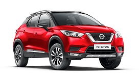
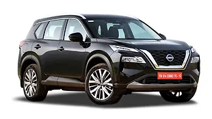
Nissan has made it to this list thanks to the Kicks SUV. It’s the newest system in the list and gives us a preview of what we can expect, not just from Nissan, but also from other Japanese automakers, in terms of future systems. The touchscreen display is a smooth looking silvery sheet rising out of the dashboard. We like the quality of plastics used in the buttons and they are placed at a good level.

It has scored high in terms of display size and has a good backlighting system which provides better visibility in sunlight.
The latter also gets a level up due to the angle and placement of the screen. However, the display has been given a glossy finish and this means, a plethora of fingerprints all over.

The USB and AUX ports are placed below the climate control dials and like the Hyundai, it’s a tightly packaged space. However, it comes with a deep cubby hole that prevents wires from dangling over the gear lever.

In terms of features, Nissan has been pretty straight forward and linked all connectivity to Apple CarPlay/Android Auto. One of the party pieces for the Kicks is its 360-degree camera.

There’s one camera in the front, one in the rear and two in the wing mirrors and this gives the driver a surround view. It is a great addition, but the resolution of the surround cameras is not too great.

The interface of the Kicks is that of a smart phone from the start of this decade. There is a pleasant blue tinge to the overall appearance and all the icons are large and easily legible. As we have seen in the Vento, a simple interface with easy to read fonts and bright colours is far more effective in getting you to where you need to rather than a multitude of steps.

Unlike the other cars featured in this review, the Kicks’ secondary audio controls are a separate stalk behind the wheel rather than buttons on the steering face. It looks aftermarket and requires you to move your hand from the three o clock position to use it. In the music quality test, the Kicks scored 2.5/5, which is a mid-level score in this competition. The sound quality was acceptable and you could hear the transitions in the song but, compared to the Vento, it feels a few levels inferior.
Ford EcoSport- 197.7/400

Why I would touch it- SYNC3 Interface and placement of the screen
Why I wouldn’t touch it- Placement of input ports

It has been a closely fought battle among the top seven, but the winner in this touchscreen comparison test is Ford’s SYNC3 infotainment system with a clear margin.

Things look quite exciting right from the beginning as the car gets an 8.0-inch floating display. The dashboard of the EcoSport has a downward slant moving from the glass area towards the cabin and the display lines up with the slant in such a way that its top sections just about stick up to the top line of the dashboard.

This angle of placement shields it well against the glare of the sun and because Ford uses light colours, the fingerprint smudges are not noticeable until the display is switched off. However, while the display screen may be of a significant size, but the actual area used for display is considerably smaller and confined by a huge black border.

The EcoSport and Kicks have roughly the same concept when it comes to button and dial layout but where the Kicks has proper well defined buttons, the EcoSport’s buttons feel a tad bit small.

There are two USB ports and both are in line with the gear lever with little or no space to place your smart device.
One of the major things that has swung the vote in favour of the EcoSport is the interface. It was a popular choice among all the testers and this was mostly due to the simple yet elegant design. We also liked the colour schemes of multiple shades of their signature blue behind black text.

Ford has also been clear about connectivity options and requires you to have a smart device connected. It comes with both Apple CarPlay and Android Auto and once you have your phone plugged in, all the major feature like maps, music and telephone connectivity get their individual icons. There are also some specific apps that can be downloaded like Waze (iOS) or MapmyIndia (Android Auto), Glympse and Accuweather.

Finally, in the music quality test, the EcoSport scored an average of 3.4/5 for the music quality test. This is the second highest score in this new test that we came up with and this achievement is primarily due to its ability to correctly output the highs and lows as well the transitions from side to side.
Photos
Kapil Angane
Kaustubh Gandhi

